Color
The Science Behind Color – Part Two
In last week’s blog, we discussed what color actually is and how the eye perceives it. We talked about the science behind color theory and gave our readers a little insight as to why we view colors the ways we do. Today, we’re going to delve even deeper and discuss the psychology of colors and how they can evoke certain emotions.
But First…The Basics
We’ll start with a little experiment. Think of your favorite color. How does it make you feel? What emotions does it produce…inspiration, relaxation, strength? Can you explain why this is the case? Maybe or maybe not.
Some people may choose a color because it complements their hair while others might have a very in-depth response. However, color has been shown to stir up emotions in people. We’ve compiled a list below (along with some great quotes we found!) about the different feelings people have encountered when experiencing colors.
Red
Positive Connotations: Love, passion, determination, power, desire
Negative Connotations: Danger, blood, war, anger
Miscellaneous Example: “When in doubt, wear red.” –Bill Blass
Orange
Positive Connotations: Happiness, enthusiasm, sunsets
Negative Connotations: Deceit, distrust
Miscellaneous Example: “Orange is the happiest color.” –Frank Sinatra
Yellow
Positive Connotations: Exuberance, joy, sunshine, happiness
Negative Connotations: Overstimulation, warnings
Miscellaneous Example: “How wonderful yellow is. It stands for the sun.” –Van Gogh
Green
Positive Connotations: Nature, freshness, new, growth
Negative Connotations: Envy, greed, cowardice
Miscellaneous Example: “Green is the prime color of the world and that from which its loveliness arises.” –Pedro Calderon de la Barca
Blue
Positive Connotations: Tranquility, water, intelligence, freshness
Negative Connotations: Seriousness, sadness
Miscellaneous Example: “I never get tired of the blue sky.” –Van Gogh
Purple
Positive Connotations: Royalty (!!!), independence, ambition, luxury
Negative Connotations: Sadness, gloom, extravagance
Miscellaneous Example: “Purple is the color of my life.” –Delors C. Walker
White
Positive Connotations: Purity, innocence, light, cleanliness
Negative Connotations: Sterility, too boring
Miscellaneous Example: “Never use pure white. It doesn’t exist in nature.” –Aldro T. Hibbard
Black
Positive Connotations: Sophistication, class, modern, power, prestige
Negative Connotations: Darkness, the unknown, fear
Miscellaneous Example: “Women who wear black lead colorful lives.” –Neiman Marcus
Grey
Positive Connotations: Sleekness, modern, cleanliness
Negative Connotations: Sterile, boring, an “in between” feeling
Miscellaneous Example: “The color of truth is grey.” Andre Gide
We hope you’ve enjoyed our little venture into the science behind color. Color is one of our favorite parts about painting, as it gives us a chance to go bold and try new things! From your favorite color or an accent piece in a complementary color, Royalty can paint it all! Give us a call today for your complimentary consultation!
Color
The Science Behind Color – Part One
Color is one of the most important aspects of any design plan. In fact, many people plan entire rooms around pieces that are a certain color. Today, Royalty Finishes is going to explore the science behind color, the first in a two-part blog series.
Basic Color Theory
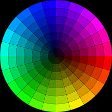
Color theory is historically broken up into three groups: the color wheel, harmonious colors, and context. The human eye is capable of distinguishing about 10 millions different colors, each with subtle differences in a varying scale. This theory is how the eye perceives colors.
The Color Wheel
The color wheel is split into three different sections:
- Primary Colors – Red, blue and green are considering primaries. Think of primary colors as the building blocks. No other pigment can be mixed to create these hues and every other shade is derived from them.
- Secondary Colors – When primary colors are mixed, secondary colors are created. Red and yellow creates orange, blue and yellow makes green, and blue and red produces purple.
- Tertiary Colors – Colors are kind of like genetics…you mix certain colors enough to dilute them into something uniquely different. These colors appear when a primary and a secondary color are combined, such as blue-green or red-orange.
Harmonious Colors
This section is also split up, but into only two categories:
- Analogous Colors – These colors are in the same color family, but build on different shades. An example would be decorating a room in royal blue with touches of blue-green and deep blue.
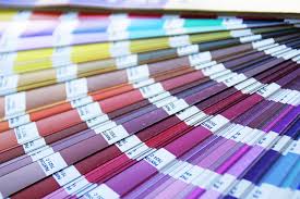
- Complementary Colors – Although in different color families, some shades work very well together. For instance, a purple wall would really stand out with accents in different shades of green. Complementary colors are usually found on the opposite side of a color wheel. The best example is to think of the paint color swatch combinations you see at home improvement stores…they’re suggesting colors to really make your room pop!
Context
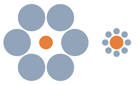
This topic is more scientific than the other two mentioned. However, color context is how your eye perceives different hues. Just as an example, the dots in the center of the graphic are the exact same size, but your eye doesn’t see it that way. Color can be just as tricky!
Join us again next week as we dive off into the second part of our science behind color series!
Design
Determine Your Design Style
One of the most common questions designers ask during a home remodeling is “What’s your style?” This seems like such an innocuous question, but it’s really important when determining ideas for your home or office…and it’s surprisingly difficult for some people to answer! Royalty Finishes is here to help you determine your design style!
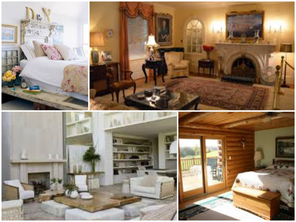
Classic/Traditional
When we think of classic or traditional designs, the picture that pops into our heads is an 80’s movie, in the living room or office of the rich kid from school. While there are obviously many modern touches that can be applied today, there are several elements that this design style includes:
- Heavy furniture, usually in wood, leather, or plush seating pieces
- Mostly chocolate brown, black, deep red, or gold
- Ornate accessories, such as beveled mirrors or Oriental rugs
Modern/Contemporary
This style is kind of what you might think of as a penthouse suite in New York. The minimalism look really started taking off after Swedish company IKEA started selling sparse looking pieces, which were useful in European cities that mostly consisted of apartments. Preferences towards a contemporary feel include:
- Comfortable but lightweight pieces with a more squared edge
- Designs which include metal or glass
- Cool neutral colors such as black, white, or grey; sometimes with pops of color
Shabby Chic
Eclectic and fun, “shabby chic” throws together mix-n-match styles, patterns, and colors to create a comfortable, semi-vintage look. It’s become very popular in the last several years. You might think of an adorable and comfy bed & breakfast suite when this style comes to mind.
- Quilts, lace, and gingham fabrics
- Mixed furniture styles, from traditional to minimalist (sometimes you’ll find them refinished!)
- Cool colors, mostly whites and sometimes pastels
Rustic
A room designed with a rustic feel in mind might make you feel like you’re visiting a ranch or ski lodges. This style is actually quite popular in Texas and other regions where hunting occurs more often.
- Exposed brick, wood, or natural stone walls and flooring
- Neutral or jewel tones like dark brown, khaki, hunter green, or navy
- “Raw” wooden furniture, plaids, and quilts
While Royalty Finishes won’t design your entire room, we tailor our projects to work AROUND your style, from faux finishes to painted floor and furniture. We offer a variety of options to make sure the finishing touches match true to your style.
Trends
Upcoming Trends For 2016
Are you excited about the new year? Is part of your goal to transform your home into a little something different? Royalty Finishes is really excited to introduce you to the upcoming trends for 2016 to help get your creative juices going!
Color(s) Of The Year
Pantone, the world’s leading “color authority,” has chosen not only one but TWO colors for 2016! The colors are called Rose Quartz and Serenity, a warmer pink and a pretty periwinkle blue. The focus of this choice seems to be on creating calm and peace within your home or office. Royalty can create a spa-like look with these colors in your home or office, so you’re sure to enjoy tranquil moments throughout the day.
Sherwin-Williams paint has also introduced “Alabaster” as their color of the year. This choice of shade is a nod to warmth, simplicity, and mindfulness. Think of it as a warm, fuzzy blanket! SW offers another really great tool called “Color Forecast” that gives designers tips and inspiration.
Geometrics
You’ve seen some of our latest pieces. Geometric shapes are going to be really big in 2016! The patterns focus on consistency and fluidity, instead of the erratic movements of abstracts. While they’re both amazing to work with, geometrics create a certain challenge we enjoy! Check out our work to see what we mean!
Mixed Metals & Metallics
The new year is going a little retro! It’s all about gold, silver, and weathered brass in 2016! Adding pops of shimmer to highlight or showcase a particularly spectacular piece of are or a wall can make your room like a museum showcase. We can create a variety of looks, from subtle to bold, depending on your tastes and preferences.
Say Goodbye To Classic
Feel free to let your inner artist out! Wavy tiles, bright colors, fun patterns…designers from all over are saying to let go of neutral hues and simple patterns and go bold! If you’re intimidated by “too much too soon,” try it by adding one accent wall with a bright pop of color and an unusual texture with a few contrasting throw pillows. Either way, Royalty can help you find the right balance.
We are SO looking forward to the promise of a fresh start! Royalty Finishes wishes you the happiest of new years and we wish you love, health, and happiness in 2016!



Recent Comments