Color
The Science Behind Color – Part Two
In last week’s blog, we discussed what color actually is and how the eye perceives it. We talked about the science behind color theory and gave our readers a little insight as to why we view colors the ways we do. Today, we’re going to delve even deeper and discuss the psychology of colors and how they can evoke certain emotions.
But First…The Basics
We’ll start with a little experiment. Think of your favorite color. How does it make you feel? What emotions does it produce…inspiration, relaxation, strength? Can you explain why this is the case? Maybe or maybe not.
Some people may choose a color because it complements their hair while others might have a very in-depth response. However, color has been shown to stir up emotions in people. We’ve compiled a list below (along with some great quotes we found!) about the different feelings people have encountered when experiencing colors.
Red
Positive Connotations: Love, passion, determination, power, desire
Negative Connotations: Danger, blood, war, anger
Miscellaneous Example: “When in doubt, wear red.” –Bill Blass
Orange
Positive Connotations: Happiness, enthusiasm, sunsets
Negative Connotations: Deceit, distrust
Miscellaneous Example: “Orange is the happiest color.” –Frank Sinatra
Yellow
Positive Connotations: Exuberance, joy, sunshine, happiness
Negative Connotations: Overstimulation, warnings
Miscellaneous Example: “How wonderful yellow is. It stands for the sun.” –Van Gogh
Green
Positive Connotations: Nature, freshness, new, growth
Negative Connotations: Envy, greed, cowardice
Miscellaneous Example: “Green is the prime color of the world and that from which its loveliness arises.” –Pedro Calderon de la Barca
Blue
Positive Connotations: Tranquility, water, intelligence, freshness
Negative Connotations: Seriousness, sadness
Miscellaneous Example: “I never get tired of the blue sky.” –Van Gogh
Purple
Positive Connotations: Royalty (!!!), independence, ambition, luxury
Negative Connotations: Sadness, gloom, extravagance
Miscellaneous Example: “Purple is the color of my life.” –Delors C. Walker
White
Positive Connotations: Purity, innocence, light, cleanliness
Negative Connotations: Sterility, too boring
Miscellaneous Example: “Never use pure white. It doesn’t exist in nature.” –Aldro T. Hibbard
Black
Positive Connotations: Sophistication, class, modern, power, prestige
Negative Connotations: Darkness, the unknown, fear
Miscellaneous Example: “Women who wear black lead colorful lives.” –Neiman Marcus
Grey
Positive Connotations: Sleekness, modern, cleanliness
Negative Connotations: Sterile, boring, an “in between” feeling
Miscellaneous Example: “The color of truth is grey.” Andre Gide
We hope you’ve enjoyed our little venture into the science behind color. Color is one of our favorite parts about painting, as it gives us a chance to go bold and try new things! From your favorite color or an accent piece in a complementary color, Royalty can paint it all! Give us a call today for your complimentary consultation!
Color
The Science Behind Color – Part One
Color is one of the most important aspects of any design plan. In fact, many people plan entire rooms around pieces that are a certain color. Today, Royalty Finishes is going to explore the science behind color, the first in a two-part blog series.
Basic Color Theory
Color theory is historically broken up into three groups: the color wheel, harmonious colors, and context. The human eye is capable of distinguishing about 10 millions different colors, each with subtle differences in a varying scale. This theory is how the eye perceives colors.
The Color Wheel
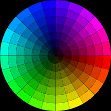
The color wheel is split into three different sections:
- Primary Colors – Red, blue and green are considering primaries. Think of primary colors as the building blocks. No other pigment can be mixed to create these hues and every other shade is derived from them.
- Secondary Colors – When primary colors are mixed, secondary colors are created. Red and yellow creates orange, blue and yellow makes green, and blue and red produces purple.
- Tertiary Colors – Colors are kind of like genetics…you mix certain colors enough to dilute them into something uniquely different. These colors appear when a primary and a secondary color are combined, such as blue-green or red-orange.
Harmonious Colors
This section is also split up, but into only two categories:
- Analogous Colors – These colors are in the same color family, but build on different shades. An example would be decorating a room in royal blue with touches of blue-green and deep blue.
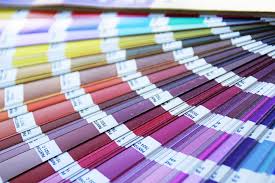
- Complementary Colors – Although in different color families, some shades work very well together. For instance, a purple wall would really stand out with accents in different shades of green. Complementary colors are usually found on the opposite side of a color wheel. The best example is to think of the paint color swatch combinations you see at home improvement stores…they’re suggesting colors to really make your room pop!
Context
This topic is more scientific than the other two mentioned. However, color context is how your eye perceives different hues. Just as an example, the dots in the center of the graphic are the exact same size, but your eye doesn’t see it that way. Color can be just as tricky!
Join us again next week as we dive off into the second part of our science behind color series!
Design
Determine Your Design Style
One of the most common questions designers ask during a home remodeling is “What’s your style?” This seems like such an innocuous question, but it’s really important when determining ideas for your home or office…and it’s surprisingly difficult for some people to answer! Royalty Finishes is here to help you determine your design style!
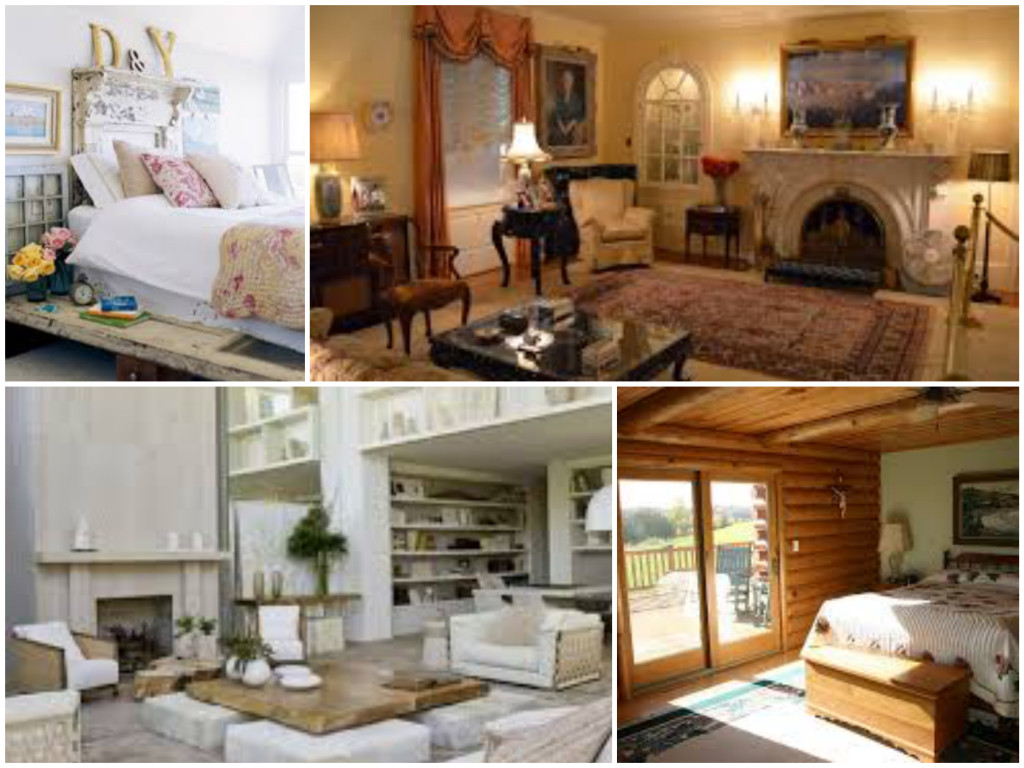
Classic/Traditional
When we think of classic or traditional designs, the picture that pops into our heads is an 80’s movie, in the living room or office of the rich kid from school. While there are obviously many modern touches that can be applied today, there are several elements that this design style includes:
- Heavy furniture, usually in wood, leather, or plush seating pieces
- Mostly chocolate brown, black, deep red, or gold
- Ornate accessories, such as beveled mirrors or Oriental rugs
Modern/Contemporary
This style is kind of what you might think of as a penthouse suite in New York. The minimalism look really started taking off after Swedish company IKEA started selling sparse looking pieces, which were useful in European cities that mostly consisted of apartments. Preferences towards a contemporary feel include:
- Comfortable but lightweight pieces with a more squared edge
- Designs which include metal or glass
- Cool neutral colors such as black, white, or grey; sometimes with pops of color
Shabby Chic
Eclectic and fun, “shabby chic” throws together mix-n-match styles, patterns, and colors to create a comfortable, semi-vintage look. It’s become very popular in the last several years. You might think of an adorable and comfy bed & breakfast suite when this style comes to mind.
- Quilts, lace, and gingham fabrics
- Mixed furniture styles, from traditional to minimalist (sometimes you’ll find them refinished!)
- Cool colors, mostly whites and sometimes pastels
Rustic
A room designed with a rustic feel in mind might make you feel like you’re visiting a ranch or ski lodges. This style is actually quite popular in Texas and other regions where hunting occurs more often.
- Exposed brick, wood, or natural stone walls and flooring
- Neutral or jewel tones like dark brown, khaki, hunter green, or navy
- “Raw” wooden furniture, plaids, and quilts
While Royalty Finishes won’t design your entire room, we tailor our projects to work AROUND your style, from faux finishes to painted floor and furniture. We offer a variety of options to make sure the finishing touches match true to your style.
Trends
Upcoming Trends For 2016
Are you excited about the new year? Is part of your goal to transform your home into a little something different? Royalty Finishes is really excited to introduce you to the upcoming trends for 2016 to help get your creative juices going!
Color(s) Of The Year
Pantone, the world’s leading “color authority,” has chosen not only one but TWO colors for 2016! The colors are called Rose Quartz and Serenity, a warmer pink and a pretty periwinkle blue. The focus of this choice seems to be on creating calm and peace within your home or office. Royalty can create a spa-like look with these colors in your home or office, so you’re sure to enjoy tranquil moments throughout the day.
Sherwin-Williams paint has also introduced “Alabaster” as their color of the year. This choice of shade is a nod to warmth, simplicity, and mindfulness. Think of it as a warm, fuzzy blanket! SW offers another really great tool called “Color Forecast” that gives designers tips and inspiration.
Geometrics
You’ve seen some of our latest pieces. Geometric shapes are going to be really big in 2016! The patterns focus on consistency and fluidity, instead of the erratic movements of abstracts. While they’re both amazing to work with, geometrics create a certain challenge we enjoy! Check out our work to see what we mean!
Mixed Metals & Metallics
The new year is going a little retro! It’s all about gold, silver, and weathered brass in 2016! Adding pops of shimmer to highlight or showcase a particularly spectacular piece of are or a wall can make your room like a museum showcase. We can create a variety of looks, from subtle to bold, depending on your tastes and preferences.
Say Goodbye To Classic
Feel free to let your inner artist out! Wavy tiles, bright colors, fun patterns…designers from all over are saying to let go of neutral hues and simple patterns and go bold! If you’re intimidated by “too much too soon,” try it by adding one accent wall with a bright pop of color and an unusual texture with a few contrasting throw pillows. Either way, Royalty can help you find the right balance.
We are SO looking forward to the promise of a fresh start! Royalty Finishes wishes you the happiest of new years and we wish you love, health, and happiness in 2016!
Furniture
Treat Yourself To A Fabulous Furniture Upgrade
We’ve told you about how we can paint walls…and cabinets…and floors. But have you thought about changing up your furniture? Today, we’ve got several reasons why you should treat yourself to a fabulous furniture upgrade this holiday season!
Spin The Color Wheel
You can choose silver (bells), pick a white (Christmas), or go as red as Rudolph’s nose! If you’re tired of the same old furniture, Royalty can help you revamp it into a whole new look, starting with the color!
To Stain Or Not To Stain
We aren’t talking stains on the carpet from St. Nick’s sooty boots! There are SO many options to choose from with furniture rehabs! You can opt for staining or glazing, distressing or antiquing…these are just a few of the options available to Royalty customers!
Repurpose Instead Of Purchase
Instead of buying new furniture (or putting it on your Christmas wish list), we strongly recommend that you look into giving your sad old pieces a beautiful face-lift! Over time, furniture stains can look dated, perhaps due to chipping or because a particular color is not longer trendy. Don’t throw out your old furniture! Repurpose them with a fresh coat of paint or stain for a whole new look!
Keep Your Memories
Perhaps that old chair was the one you snuggled up in with your grandparents to read Christmas stories. Or the dining room table is the one that your family has gathered around for generations. There’s no need to throw away those memories because the style doesn’t match your existing décor. Just call Royalty to set up an appointment to help those keepsakes fit in and get modernized.
All of us at Royalty Finishes want to wish you a beautiful Christmas filled with hope, love, and warmth. Happy holidays!
Floors
The Benefits Of Concrete Flooring
In an age of tile and wood-style flooring, concrete flooring doesn’t always get the kudos it deserves. Royalty has a quick list of the great reasons to consider upgrading your concrete flooring today!
Low-Maintenance
As-needed sweeping and a weekly mop is all concrete floors require as far as maintenance. Royalty will properly seal any stains or designs to protect them, so all you have to do is a quick clean. No fancy brooms, no expensive specialty products…just a little soapy water and a mop!
Versatility
Any number of looks can be completed with concrete flooring, from glossy to matte finishes. The high shine “wet” appearance can create a marble or granite illusion and more matte finishes can create a softer look. Just ask us how!
Uniqueness
Most concrete floors are poured at the time a house is built. While there will be some cracks due to settling and time, these imperfections are actually a huge bonus for creating unique looks! No other home or office will have the same appearance.
Cost Savings
Natural hardwood and some tiles like travertine are incredibly expensive. Since concrete is already part of your home’s architecture, it’s just a matter of adding some polish and elbow grease to create an amazing look. The price difference between using your existing structure and having to pay for new materials can be substantial!
Sustainability
Concrete can LAST! No need to worry about spilling red wine on it like you would for carpet or about indoor pets scratching your hardwood. It’s incredibly durable and with a professional, it will be made to last.
Royalty can help you revamp your house, from floors to ceilings! We hope you’re interested in the amazing work we can do for concrete flooring…it’s one of our many skills. Don’t forget about our special holiday offer for a free accent wall. This offer includes booking a floor face-lift!
Faux Painting
Four Great Reasons To Go Faux
So what’s the deal with faux finishing? It’s been highlighted in tons of popular home improvement shows and lots of interior decorating magazines, but what is so special about faux painting? In this week’s blog, Royalty has four great reasons to go faux!
It’s Customizable
If you’re looking to add several different colors to a room, faux finishing can help make that look a reality. From colors to textures to sheens, faux painting can help you create amazing looks that are one of a kind! There’s no need to go with the same boring beige as everyone else when you can make something completely unique.
It Creates Movement & Texture
There’s nothing flat about faux. The whole purpose of faux painting is to create textures and finishing that bring the eye to the movement and flow of the surface. Whether the look is wood, marbled, or fabric (see our previous blog on the different techniques of faux finishing), the look is designed to mimic another material while providing a durable finish on your walls.
It’s Less Expensive
A quick web search found that a 100×68 inch slab of 3cm thick marble is over $2,200! Royalty Finishes can create the look of marble on a surface for a fraction of that cost. While having the real deal is certainly nice, it definitely doesn’t fit the budgets of most homeowners. At Royalty, we have the experience to recreate many different materials without breaking your budget.
It Makes Your House Looks Like Art
Flat paints are so boring! Like a beautiful sculpture or fantastic painting, we want to help you showcase your home. Various finishes and textures can help highlight your home’s best features (or even draw attention away from areas you don’t like as much!). Royalty Finishes has expertise in creating one-of-a-kind looks for your home or office.
We hope you’ve enjoyed our reasons to go faux! Regina just got back from a fantastic workshop in Dallas. She learned a ton of new techniques that she can’t wait to show her customers. Don’t forget about our holiday special offer…we can’t wait to work with you. We’re already booking for next year!
Faux Painting
Faux Techniques
Faux finishing is usually defined as a decorative painting finish that appears to be something else, such as stone, wood, or marble. It’s an intricate process that requires a lot of practice and patience. However, there are several types of finishes, so today we’re going to discuss the different faux techniques you might see.
Marbleizing
Genuine marble, granite, or other stone can be really expensive. It’s one thing to have for small surfaces, such as countertops, but costs can often prohibit larger areas like walls. We use a variety of stains and glazes to mimic the appearance of the stone, giving it life by adding specific shading and veins (the lines of deeper color running throughout the stone). It’s one of the most common forms of faux finishing.
Ragging (Rag Painting)
This technique utilizes various thinned out glazes and (you guessed it!) old rags to create texture and movement on a surface. When done properly, it can create a lush, fabric-like look.
Venetian Plastering
This technique is a little more advance, as it uses different tools and multiple layers of plaster to make a highly polished look that resembles marble or other stone. It takes some time and advanced skill to properly create this look, but the use of plaster allows us to create tinted looks to match your color scheme.
Color Washing
This is one of the most common types of faux finishes. It layers multiple colors or glazes that are painted on with different brushes and blended together to create a more three-dimensional look. This technique combines different shades of color to give a wall a “moving” feel.
Graining
Like marbleizing, the graining technique mimics the look of its natural counterpart…however, in this case, the final product looks like wood instead of stone. Natural hardwood can be very expensive and sometimes not be the best option for walls. This painting technique can give you the beautiful look of real wood with a little bit more durability.
We hope you’ve learned a little about some of the techniques Royalty Finishes can offer. We offer a variety of options for your home or office…these are just a few!
Also, don’t forget our special holiday offer! Read our blog to find out more about our gift to you.
Special Offers
The Gift Of Gratitude
Gratitude. Thankfulness. Appreciation. Acknowledgement. Gratefulness.
Thanksgiving means a lot of things to different people. Some consider it an obligatory family holiday. Others look forward to a day of (almost) guilt-free eating and football. Others feel that it’s something more. At Royalty Finishes, we truly believe in the gift of gratitude.
(be sure to read all the way through…we have some amazing news inside!)
My Thanksgiving Memories
Any Thanksgiving tradition my family has always been centered around FOOD! I am nostalgic for my grandmother’s chocolate meringue pie. The recipe has been passed down for four generations, but it never seems to be quite as good as when my grandmother made it. Or her cornbread dressing…YUM!
Why I’m Thankful For YOU!
Our customers mean the world to me. They give me an opportunity to turn my dreams into a reality. Every time I step into a new house for a project, I have the chance to help reinvent someone’s home. My job helps me to “feed my addiction,” if you will. I love being able to create something out of someone’s ideas. Working directly with my customers to help them reimagine their living space is such a reason for me to give thanks…and not just on Thanksgiving.
How We Express Our Thanks To You
To show customers my appreciation for them, I’m offering a FREE (yes, you read that right!) accent wall valued up to $500! Pretty amazing, right?
To qualify for this offer, the following conditions must be met:
- A painting project with a $300 minimum value must first be booked no later than 5pm on December 31, 2015, in order to be eligible for the free accent wall.
- All projects must be scheduled after January 1, 2016
- The accent wall shall have a maximum price of up to $400
- All of our finishes and designs have various price ranges. Should your option price be greater than $400, you would be responsible for the difference in cost.
For example, if you book a job with me to paint your kitchen cabinets, I would paint a FREE accent wall in your dining room! Or we contract to faux finish your powder room, and you get to choose a FREE accent wall finish in your bedroom! The combinations are endless!
I am happy to help answer any of your questions about painting, whether it’s your cabinets, walls, or furniture. Royalty Finishes offers free estimates and sample finishes for all of your projects, because your happiness with the final product is our goal.
Where Painting Is Art And Your Home Is Our Canvas.
Faux Painting
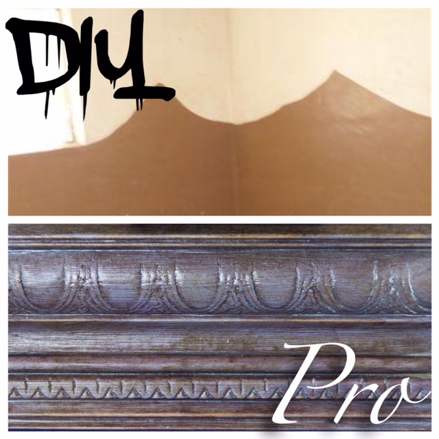
Do-It-Yourself Or Hire A Pro?
Sometimes DIY doesn’t always mean “do-it-yourself”. Often times, it can end up meaning “did it yucky”. People often throw around the question of do-it-yourself or hire a pro. Some projects that have online tutorials, like baking, decorating ideas, and workout tips, often work out great for the users. However, there are some things, like faux painting, which you shouldn’t try on your own. We have some reasons why it’s better to hire a pro.
The Two E’s: Equipment & Education
Faux finishing requires specific techniques and those techniques require specific tools. Some patterns and specialized looks cannot be created without certain pieces of equipment. These pieces aren’t often available to the public
Regina trained at Vigini Studios in San Antonio on how to create customized looks for your home or office. She also continued her painting education with Faux Effect classes with Master Teachers. Regina even takes “continuing education” courses so she’s always up-to-date on the latest trends and techniques. This kind of experience just isn’t something that can be learned from a YouTube video or Pinterest tutorial. She has spent over ten years perfecting her technique and that’s difficult to duplicate.
It’s Easier To Start From Scratch
It’s difficult to remove ingredients from a recipe once it’s been mixed together. It’s kind of the same way with a home improvement project. Trying to correct a mistake can sometimes require more time, money, and effort than starting with a blank slate. Too-thick paint, removing wallpaper, tearing up tile…it all increases the workload.
Tiiiiime Ain’t On Your Side
Not quite like the Rolling Stones sang it, but you get our drift. It’s really easy to underestimate the amount of time required to complete a project. When you’re in a time crunch, whether it’s upcoming holidays or company coming to visit, it’s easy to overlook certain details. Your time is important…Royalty Finishes know this and we work with your schedule.
Getting In Over Your Head
Seeing a gorgeous paint scheme in a magazine can definitely get your DIY going. However, if a technique or style is beyond anything you’ve every tried before, it’s best to leave it to the pros who do it on a daily basis.
We hope we’ve been able to give you a touch of an idea of why it’s better to go with a professional than to attempt to try faux finishing yourself. While you might get close to what you imagined, it’s definitely more difficult than it looks. We want you to be happy with the finished product and we’re confident we can help transform your home or office into something spectacular!





Recent Comments